A Brookside Remodel: Personal Touches for a Family of Four
 913-717-6325
 913-717-6325
In our initial design conversations we talked with our clients (a family of four with two young girls, ages 13 and 8) about what they enjoyed about their home and what needed to change. We found out they liked color but didn’t want too many colors to overpower the English Tudor style of the house. Our mission here was to incorporate their love of yellows and reds in a way that felt special to the client yet timeless for future generations.
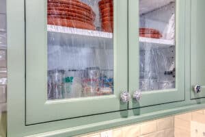
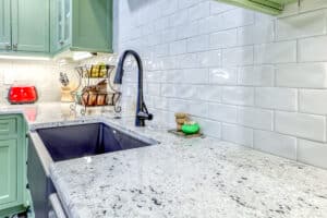
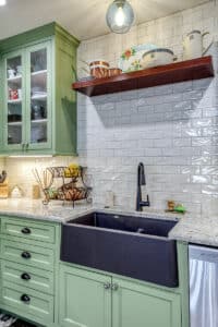
The kitchen is where we chose to go bold with color and got to embrace our clients’ love of art. Our focus was to use traditional elements in a more modern way to create a timeless but classic look that elevated the space. We brought in brand-new cabinets in an industrial finish matched to Sherwin Williams Onyx Green.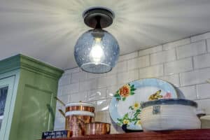
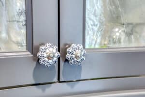
The backsplash features MSI antique white subway tile with a slight wave, which makes it a little different than a basic subway tile. We fondly refer to it as “upscaled” subway tile. The creamy white helps elevate the backsplash beyond a traditional basic white. To ensure harmony in their new kitchen with the existing yellow and reds throughout their home we brought in a granite countertop from Kansas City’s preferred countertop fabricator, SCI (called cotton white) that features creamy yellows and wine-colored reds and purples. Our clients chose to order their own hardware separately and we fell in love with her mismatched black and white cabinet pulls that are artist-made decorative glass. They help to tie in with the apron-front farm sink and matte black faucet from Moen as well as the uniquely patterned floors. The sink is a different color so we made it a highlight and feature in the room.
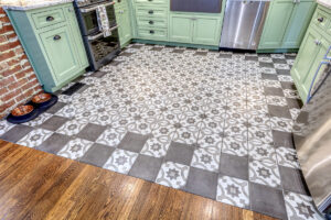 When our Wineteer team works on unique details like this kitchen floor… we get excited! This kitchen floor is certainly eclectic! We used Quartetto tiles from Daltile. This product is a fun one, as the porcelain tile comes in eight different colors and eight different decorative patterns, making it perfect for creating a unique, artistic element in your home. If you’re feeling creative and wanting to make a design that’s all your own, we can help you do so with Quartetto. The product has both warm and cool color palettes and lets you choose to create a personal design or something more traditional. The signature 8×8 shape can be easier to work with than creating a custom tile pattern from scratch which is part of the appeal. For this design we originally planned on checkerboarding the entire floor, but after seeing the layout our clients felt this would just be too busy. We pivoted and chose to checkerboard the perimeter only. This brought in the unique design that Quartetto offers without overpowering the space.
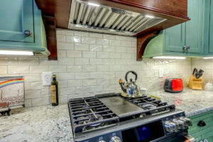
Other features of the kitchen include floating shelves which were chosen for both a highlight and contrast so our clients had additional storage but avoided what can be the monotony of continuous upper-level cabinets. We also took the backsplash tile all the way to the ceiling, which is a classic Wineteer Construction design choice that we often incorporate. The backsplash is consistent with the bicycle glass that was used for the chandelier centerpiece of the kitchen. This was the first job that we’ve ever used bicycle glass for, but since then we have used it in many other jobs as well and have our clients to thank for the fantastic shop recommendation!
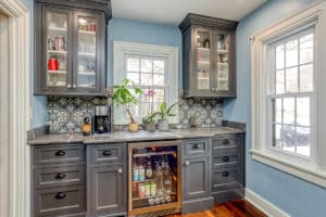
Another element of this kitchen remodel included installing a coffee bar adjacent to the kitchen. The existing space had existing cabinetry in poor condition that was replaced with new cabinets in 